Out of the Box: Simple Guidelines for Better Typography
Open a book; pick up a magazine; read a brochure… Readability is not accidental. Read these practical tips and recommendations for better typography!
When you launch your favorite layout software, you’re trusting that it shipped with the proper settings for beautiful typography. Having worked with design software since the days of Adobe PageMaker — through tests and trial and error — I’ve developed a simple set of standards and guidelines for better typography. Your layout software just needs a few tweaks for better spacing, and a careful eye for common typographic oversights.
As designers, we want the spacing between the letters and the words on the page to be perfect — for even color on the printed page, consistent letter spacing and uniform word spacing.
Open a book; pick up a magazine; read a brochure… Readability is not accidental. The typeface was carefully spaced by the type designer. The number of hyphens and placement of other punctuation should be deliberate. The double spaces are removed from the client copy. How does one keep track of all that?
These standards are grouped into five categories. We build them into brand standards manuals, and our design staff follows them as a checklist. When we receive a proof for review, we can focus on aesthetics and clarity of communications, because the small typographic details have been taken care of.
Of course, some typefaces may have letter spacing and word spacing that are more open, so you may need to adjust these settings for even color and spacing to suit your preferences.
- Search and replace to eliminate double spaces in body copy prior to proof release.
- Search and replace to eliminate double spaces after periods.
- Word breaks should be controlled by optimal hyphenation settings (see hyphenation settings dialog box).
- Manual line/word breaks should be applied sparingly. If there is a need to rewrap copy, fewer manual line breaks will minimize the risk of gaps in the text.
- Readability is best when the character count is 45 to 65 characters per line.
- The longer the line length, the deeper the leading should be. Leading creates white space that your eye uses to travel from the end of the line to the beginning of the next.
- By default, numeric characters should be set to OpenType Proportional Lining for numbers in text. Of course, exceptions can be made based on the tone of the design and if the typeface contains old style figures.
- OpenType fonts should be used when available, with key OpenType features such as ligatures and contextual glyphs enabled.
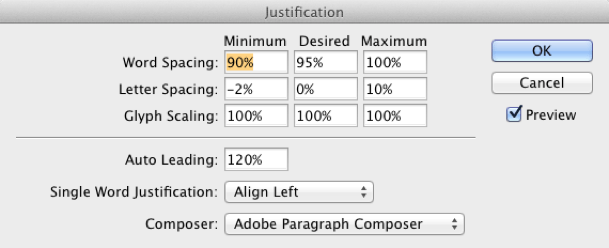
- In order to create even color and word spacing, set spacing in paragraph preferences as follows:
- Word spacing: Minimum 90%; Desired 95%; Maximum 100%
- Letter Spacing: -2%; Desired 0%; Maximum 10%
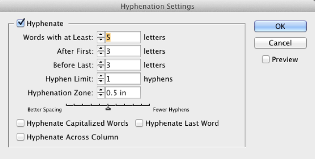
InDesign settings for Hyphenation
- Maximum: 2 hyphens in a row (ideally, only one – but your text will look fine with two in a row).
- Minimum: 3 characters before and after hyphen.
- No hyphens on capitalized words, column breaks or last words (would you want your name hyphenated?) These are on by default, and you should turn them off.
InDesign settings for Justification and Body Copy Bullets in InDesign
- Turn off hyphenation on bullet lists, subheads, and headlines.
- Bullet lists will read well with maximum +2 pts intra-bullet leading of type point size.
- Bullets require an additional minimum +20% inter-bullet spacing (one or two points); ie the space between bullets.
- The distance between a bullet and the first character in the line of text should not exceed the M square. If the bullet is too far away, it will look like it is floating away.
- The InDesign bullet style should be used where appropriate. (This is for ease of creating bullets, and creating the style sheet).
- Manual line breaks should be avoided in bullet lists.
Styles in InDesign
- All text should use paragraph styles where possible.
- Character styles should not be applied to paragraphs, but to words only.
- Keep character styles simple: bold or italic or type variant. The more attributes that are applied via a character style, the harder it is to troubleshoot seemingly inexplicable type inconsistencies in paragraphs.
Punctuation Settings in InDesign
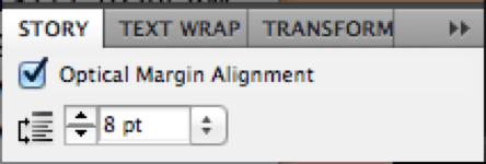
- Punctuation should hang into the margin where possible (Enable the story feature on text blocks in InDesign).
- Punctuation should not hang in bullet lists: it shifts the bullets to the left of the text block but doesn’t always shift the text.
Brian Sooy is the Chief Brand Officer of Aespire, type designer (Altered Ego Fonts) and typography expert, consulting with publications, publishers, and organizations on typographic standards, type and letterform design, and readability. Check out this typeface designed for the Bible.
Experience these guidelines in action when you read the nonprofit culture and communication handbook
Raise Your Voice: A Cause Manifesto.
Not to be reproduced without permission. Please ask, we're willing to share!
Do you have a hard time explaining what your company does or why your brand matters to people?
If you struggle to grow your business, you’re not alone. Aespire can help you create a clear message and brand that helps you grow your business. Contact us today for a consultation with a StoryBrand Certified Marketing Guide.